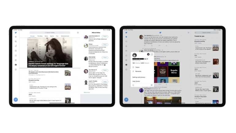
Twitter for iPad updates with a redesigned interface and multi-column layout
witter has updated its official iPad app with a redesigned interface that takes full advantage of the larger iOS device screen.
Until now, the iPad app has adopted the exact same interface as the iPhone , which means that iPad users viewed the timeline with two large unused white spaces on both sides.
Fortunately, the update sees Twitter for iPad abandon the old layout of the previous version and replacing it with a multi-column view that works both in portrait and landscape mode and puts much more content at the user’s fingertips.
If the design looks familiar, it’s because it’s quite similar to the Twitter web app layout . The menu bar has been moved from the bottom of the screen to the left side of the timeline, while trending topics and other variable content are displayed on the right side of the timeline.
Unlike third-party clients, Twitter has apparently opted to simplify things in its official app, since there is no way to customize the three-column display to display elements such as additional timelines, direct messages or mentions.
Twitter for iPad is available for free on the App Store , while existing app users can upgrade to the new version today.


Recent Comments