Less and less is missing for Apple’s WWDC, the annual conference where the company presents the new version of iOS to the general public. Last year, Apple released iOS 13 and iPadOS 1 3 for iPhone and iPad with several new features and improvements. This year is the time for iOS 14 .
Before the release, some designers and creators produced videos showing their ideas of what the next iOS should look like. Similarly, the YouTuber Avdan has made a video showing how the next iOS version should be designed by the Cupertino giant.
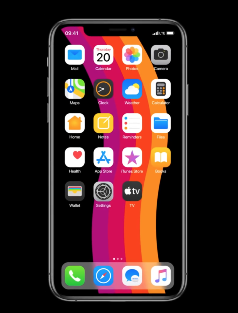
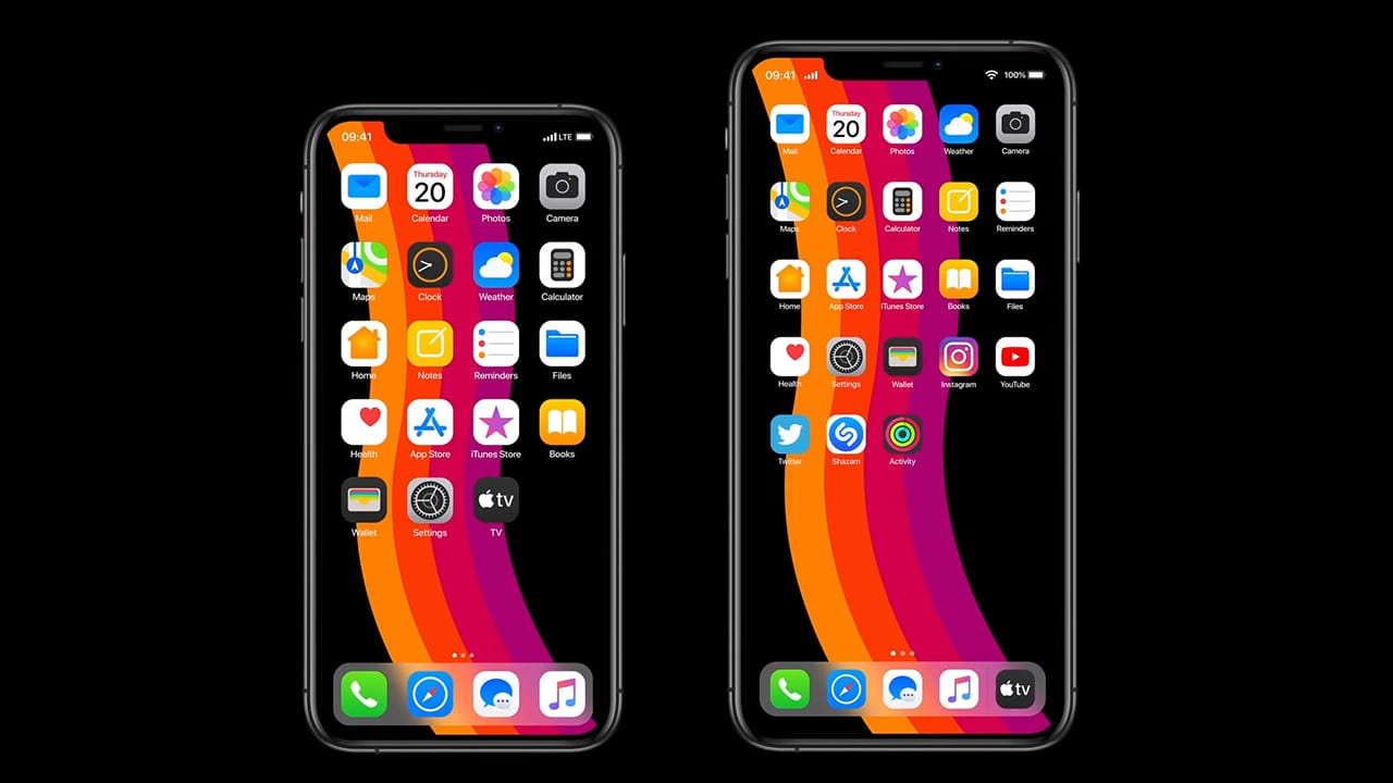
The iOS 14 concept perfects many problems that are still present in the latest versions of the operating system. The video shows a redesigned main screen with a tighter grid layout and some new icons for system apps such as photos , mail , Safari and more.

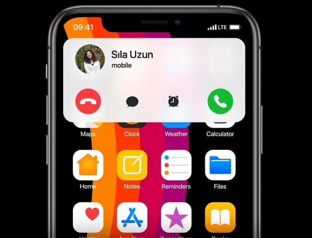
The YouTuber also redesigns the call and Siri interface , making them less invasive. In the concept, when a call is received or Siri is invoked, the user can still perform other actions since the two interfaces will occupy only the upper part of the screen and not everything, as happens on iOS 13 and earlier.

Less and less is missing for Apple’s WWDC, the annual conference where the company presents the new version of iOS to the general public. Last year, Apple released iOS 13 and iPadOS 1 3 for iPhone and iPad with several new features and improvements. This year is the time for iOS 14 .
Before the release, some designers and creators produced videos showing their ideas of what the next iOS should look like. Similarly, the YouTuber Avdan has made a video showing how the next iOS version should be designed by the Cupertino giant.
The iOS 14 concept perfects many problems that are still present in the latest versions of the operating system. The video shows a redesigned main screen with a tighter grid layout and some new icons for system apps such as photos , mail , Safari and more.

The YouTuber also redesigns the call and Siri interface , making them less invasive. In the concept, when a call is received or Siri is invoked, the user can still perform other actions since the two interfaces will occupy only the upper part of the screen and not everything, as happens on iOS 13 and earlier.

In addition to these ideas, the concept also shows a redesigned Settings app , where users can pin their favorite actions at the top of the page. There are also refinements of Apple Music , which make it more compact and intuitive. In fact, the concept also shows how users can set third-party apps as default apps . This can actually happen with iOS 14. Finally, the concept shows a new keyboard that uses the bottom part to show an emoji bar. This bottom of the keyboard is currently empty and Apple could easily implement this design with iOS 14.

Watch the video of the concept below and let us know what you think in the comments!


Recent Comments