Craig Federighi and other Apple executives talk about the new iOS 16 lock screen and call it “a true act of love”.
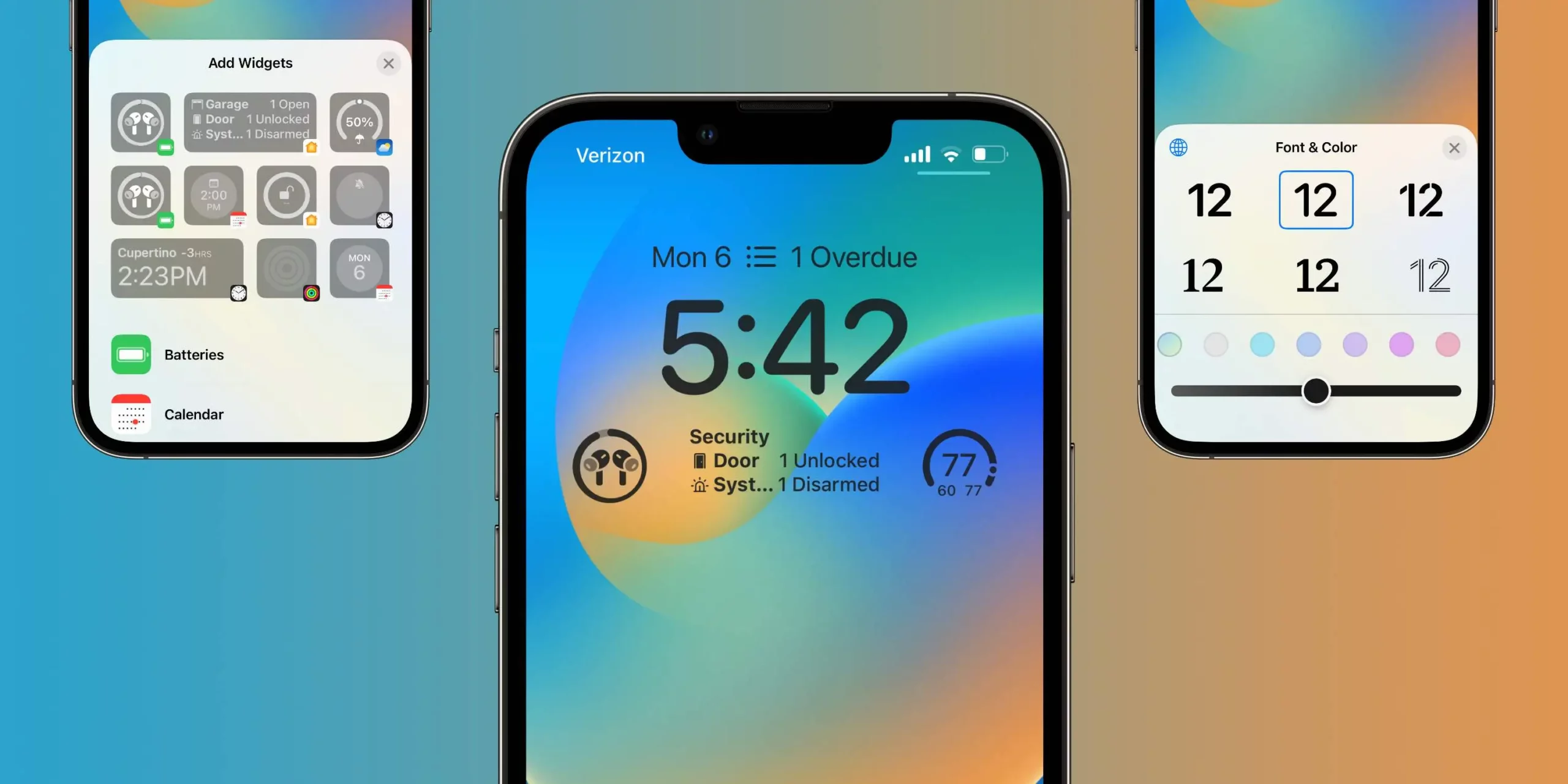
Craig Federighi and Alan Dye talked about one of the main changes in iOS 16, the new lock screen.
In an interview with TechRadar, both executives point out why Apple has decided to renew the lock screen on the iPhone.
It all started with iOS 14 when the company allowed users to add customizable widgets to the home screen. Additionally, Apple has also brought the App Library, which allows users to remove apps from the home screen that they don’t want to see all the time but need.
So with iOS 15, Full Immersion helped users decide which app they can send notifications or appear on depending on the time of day. With iOS 16, however, Apple has decided to change the lock screen to give a whole new look to the iPhone.
“We saw a real opportunity to take that area that has slowly evolved over time, but has never seen this huge breakthrough, and do something really big, but something very Apple and very personal. So, this is a true act of love, ”said Craig Federighi.
Alan Dye said Apple’s goal “was to make the iPhone even more personal” since the lock screen is the “iPhone icon”.
Dye reveals that Apple has considered changing the lock screen completely because iPhone has always been very recognizable thanks to its large clock centred at the top. The path his design team took has added custom versions of Apple’s San Francisco typeface.

“Typography is a great passion for us design teams and we have a number of other Apple design typefaces, even some non-Latin scripts. So, for the first time, we allow users to choose their favorite “.
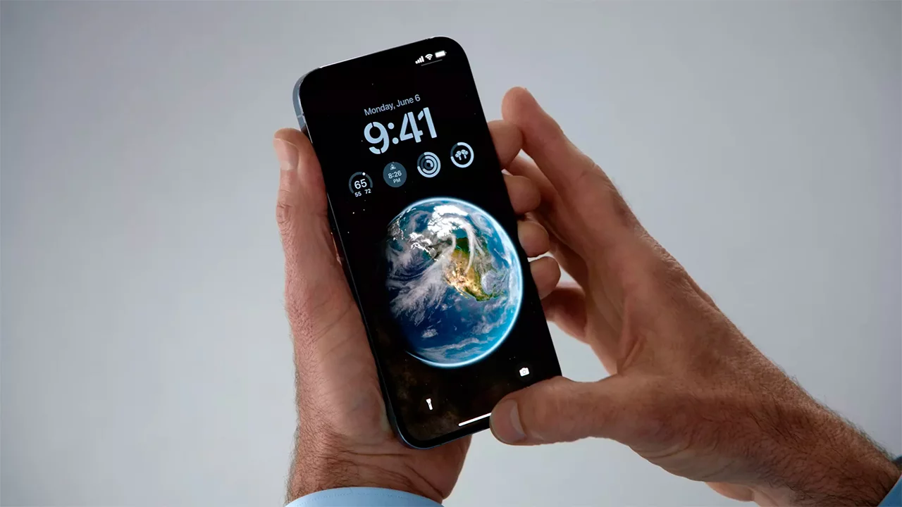
Speaking of the lock screen, Apple borrowed an idea from the Apple Watch to the iPhone by making a portrait photo appear in front of the watch, creating a depth effect.
Craig Federighi explains the company’s use of machine learning to add this functionality:
“There are actually about a dozen neural networks studying the photo based on whether it is an important subject, if there are people, how they are framed and cropped in the photo, their expressions. All of these things that allow us to automatically bring out truly amazing and compelling options for people and then render them on screen in a way that makes them feel completely new. “
In fact, it wasn’t just the face of the Apple Watch that inspired the company to change the lock screen, but the complications of the watch as well.
“Of course, we took a lot of inspiration from the Apple Watch complications in designing these widgets that offer information at a glance,” said Dye.
Craig Federighi also explained the intentionality behind the placement of widgets by balancing customization with the consistency of the iPhone interface.
“It would have been very easy for us to say, ‘Hey, drag anything everywhere.’ Honestly, technically, this wouldn’t have been a challenge, ”Federighi said.
What do you think of the new iOS 16 lock screen?


Recent Comments