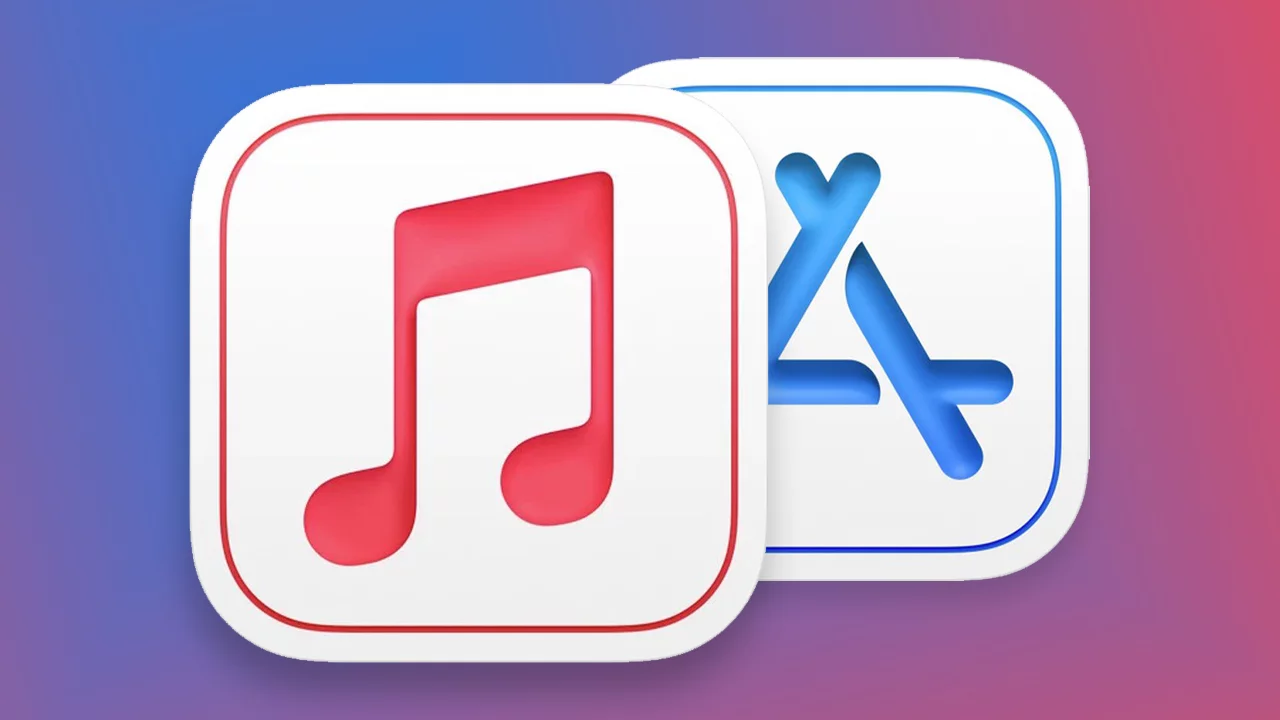
The icons of the applications that Apple is redesigning all reflect the neumorphism or the somewhat 3D style of Big Sur. For iOS 15 there is a new set of icons for all native applications
Apple Music is one of the most used streaming music services in the world and offers artists a tool that allows them to analyze the number of plays and many other data relating to their songs published on the platform.
Yesterday Apple updated the icon of the Apple Music for Artists service by updating the colors but also the style.
The most interesting thing that can be seen is that in the new icon the super flat style that has characterized iOS since version 7 is abandoned, in favor of a richer design that includes shadows to create a sort of 3D effect while remaining on very simple essential forms.

In short, the icon reflects the style of Big Sur more and this could be a very important signal. A leaker in fact, stated that on iOS 15 all the icons of the system will be recreated with the same style adopted on Big Sur and in some way the Apple Music for Artists update could be a small confirmation.
The same design change had also occurred with the App Store Connect application with the transition from very simple flat design to neumorphism.
Personally, I would very much like a new set of icons on iOS, especially if done this way, and you?


Recent Comments