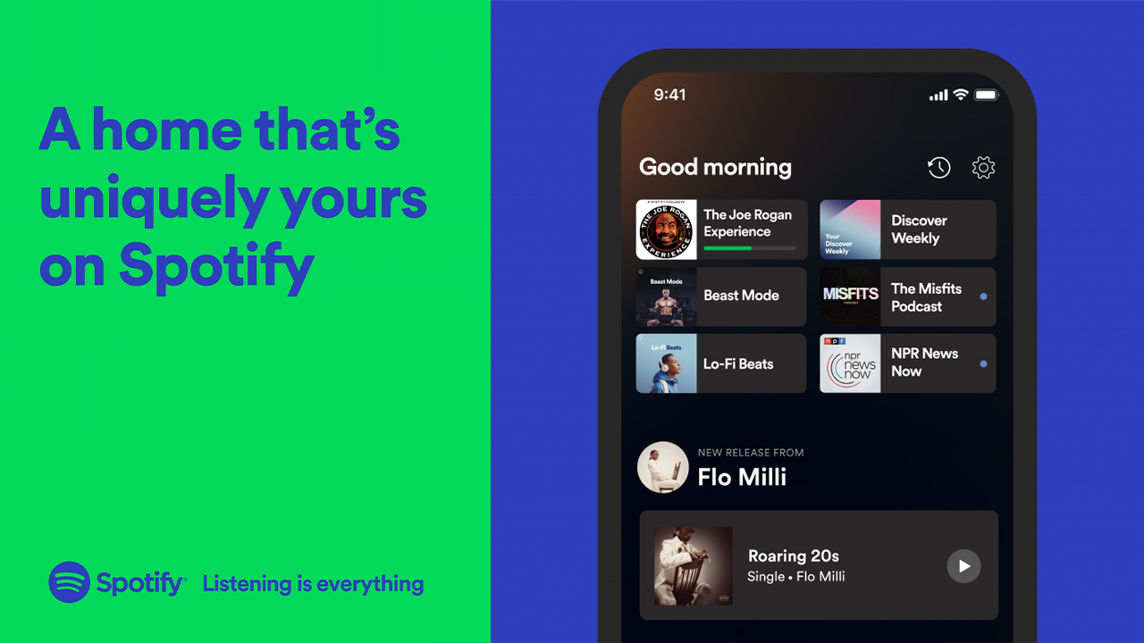
An important update that completely overhauls the Spotify application home page on both mobile platforms
Spotify has just released an update of its Home Page with several improvements and news.
The home screen is the main section from which a user can quickly choose what to listen to and it is therefore important that it works well and has everything they might need at their fingertips.
The three main innovations include:
- The addition of an icon at the top right that allows you to ” travel back in time “: we will be able to rediscover the songs in the history of previous plays up to 3 months before.
- The second section is dedicated to Podcasts: new ones are suggested and those started but not finished are also shown. New episodes will have a blue dot while those already started will show the progress bar.
- Finally, it will be possible to discover more music with a new section highlighted at the top of the Home screen dedicated to personalized recommendations related to your tastes.


Recent Comments