From today on September 13, iOS 10 is finally available to everyone. idevicecaregh team have tried this new operating system for about three months, we have seen its evolution since the first beta coming then to the Golden Master version after 8 different beta, and today we are ready to draw conclusions on a comprehensive review.
This article does not analyze all the new point after point. If you are interested in these, you will find the full changelog in this article . Below we will analyze the user experience, as we are unable to approach the innovations and how they become meaningful in everyday use. So we will see how it improves Apple’s software, what will be easy to get used and how we will further simplify life.
We must say that after 3 months of using iOS 10 is almost hard to remember iOS 9 . This does not mean that the software is completely different, in fact the basis on which it was built is just that, but the news have been integrated so well that they can be used with extreme intuitiveness. you get used very quickly and very easily this is undoubtedly the best feature of iOS .
More modern .. inspired from the App Store
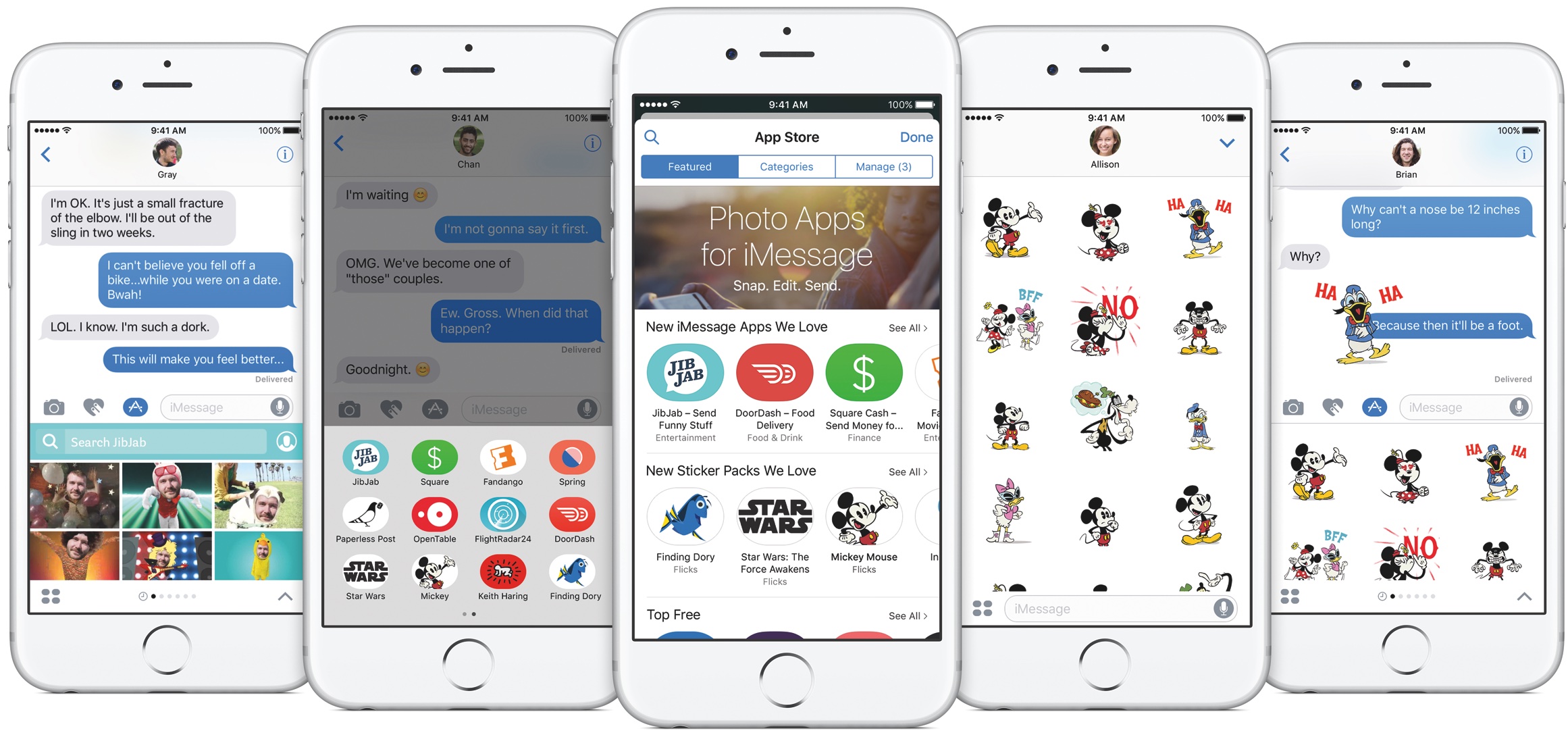
iOS 10 is the natural evolution of the previous software, which is made more modern in all respects. If up to iOS 9 Apple introduced several innovations inspired by the ideas coming from Tweak available on Cydia, this year we can say that the inspiration was the same App Store . Native applications fact, reach a new level of efficiency with different capabilities already available in other applications such as Facebook Messenger, Google Photos, and so on. This, in my opinion, is a very right choice because it makes it more youthful and competitive operating system, adding features that have become a must because of the wide use that make users. In this sense the opening of iMessage developers App Store, the stickers, the add-on, the display of the largest emoji, the ability to express emotions about a message that you receive, or the ability to send messages with special animations and clouds background will be much appreciated.

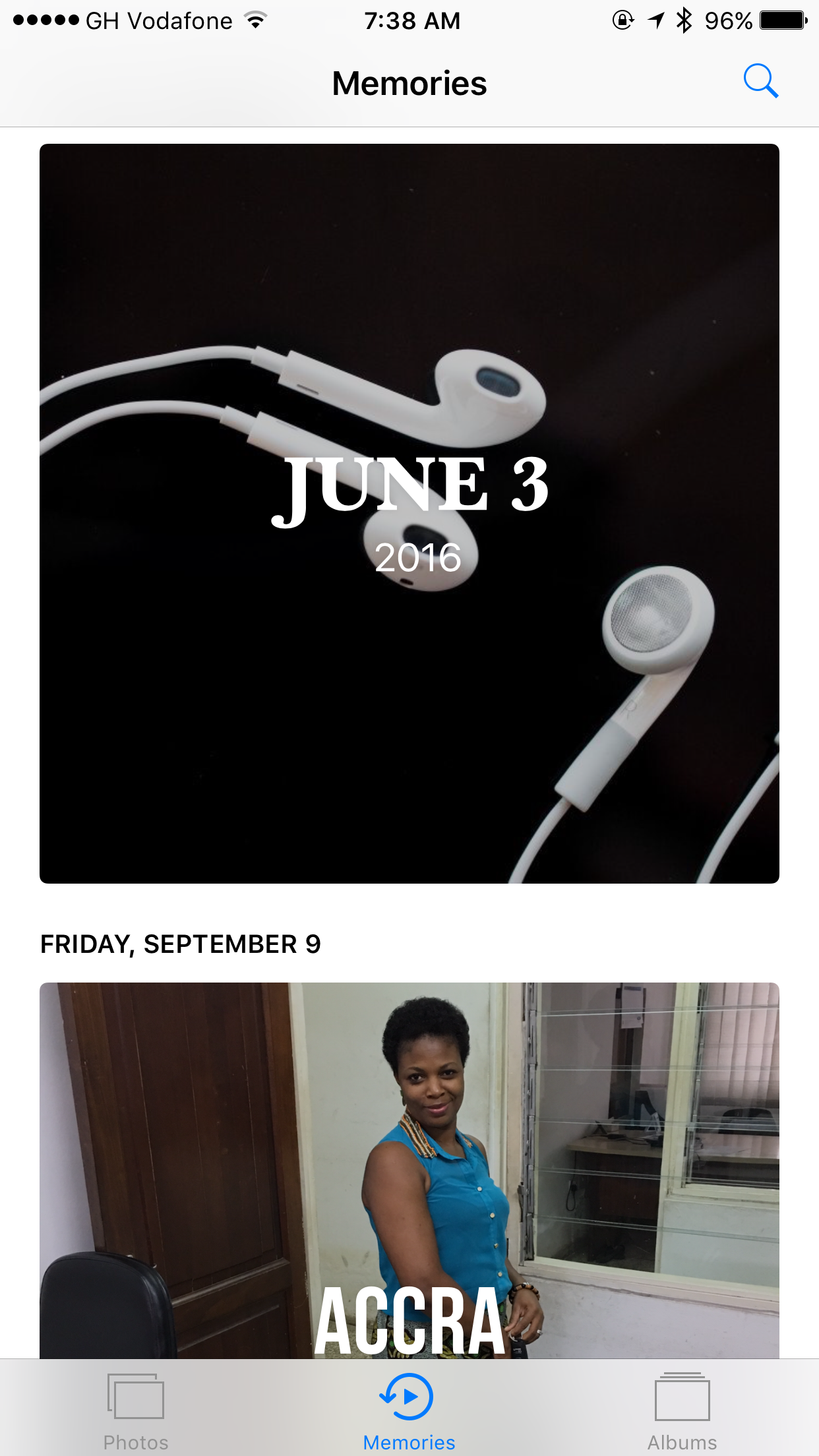
On iMessage we can also write with a pen using our fingers and we can send with Apple Watch and Digital Touch function beats or drawings in full compatibility. Similarly the application Pictures iOS now recognizes faces, create an album for each person recognized that groups all the photos where it is present, and even creates Video Memories, taking into account the place where you take each picture or video, the persons present and so on. We can also choose a theme that will change the rhythm, intensity and music with automated slide. All this happens without requiring user intervention, according to photos in the gallery, as does Google Photos.
the improved user experience more things in one place
But back to ‘ user experience of iOS 10 we can not help but from the Lockscreen . This year is completely renovated and is probably the only thing to which we will have to get used to a bit ‘. On newer devices, the screen backlight is activated automatically by simply lifting the phone from a flat surface.There is no longer the Swipe to Unlock: Now you access to the iPhone by clicking the Home button or, in devices with Touch ID, just put your finger on the Home button. The old side swipe will bring us to a new page containing the Widget, the same as on iOS 9 were displayed in the Notifications Center.
The Widget display system is the same as previously. In fact they are exposed one below the other in an order that we can handle manually. Unlike Android, you can not resize widgets or make it appear two side by side.
It also changes the graphics in some parts . The clouds of notifications and those of Widgets are larger and larger, semi-transparent to opaque background decidedly more modern, which also facilitate the reading. Once you get used to iOS 10 also because it is more convenient. Directly from the Lockscreen or a notification that appears in the top of the screen, we have the chance to see a lot more information.The operating system, in fact, supports Rich Notifications that we take away from the situation of having to open the application to interact with the Push.
Receiving a message iMessage fact, we can also see the full history of previous messages, so as to send a more appropriate response and to remember what we said to that person. Also notify you of Instagram will show the photo to which a Like or comment and we can answer knowing what we are doing, without opening the app was put. The same applies to apps and instant messaging soon there will be enhanced integration of Whatsapp right in the operating system, which will act like iMessage for notifications but will also be able to recognize the VoIP calls from this application mostrandocele contacts with the same graphics of native calls, besides the presence of appropriate keys in the address book to initiate actions directly in third-party apps.
Much faster to use: many functions are automatic, others require fewer steps
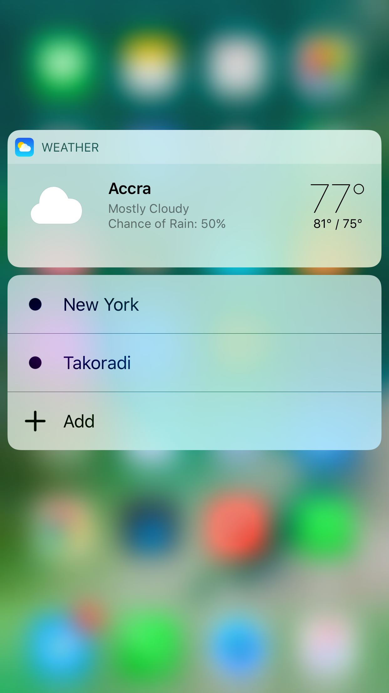
iOS 10 is practical and much faster to use : Improves Control Center , which is divided into pages. In the first we find the classic controls, with the colored buttons for better identification. In the second we find the music controls and volume management, and in the third we manage HomeKit devices we have installed in the house. Now it is actually a control center that allows us to quickly handle most things.Also new to this you will get used immediately and, if you have an iPhone 6S and 6S Plus will find much more convenient and more sensible to use the 3D Touch on app icons. In addition to the Quick Actions in fact, that are not all that useful, with 10 iOS applications can create and display real mini-widget with the forced pressure.
The mini-player by media apps, the ability to call your favorite contacts, the Weather comprehensive, summary of our physical activities and much more, without opening the app. We can finally dismiss all notifications in the Notifications Center with a forced pressure on X. Still in terms of speed of use, the application of iOS maps can figure out automatically when you leave the vehicle , saving the location of the place where you parked the ‘cars and warning us with a notification.
The automation is one of the strong points of this operating system , as well as the integration of a service within another. As you type text, iOS favors the inclusion of emoji recognizing the words we typed and proposing suggestions in the Quick Type the corresponding face, so we do not look for it among the hundreds available, and we can use them more quickly.
The answering machine is able to transcribe voice messages in text form that are left, and Apple Pay is now also enabled on Web sites as if it were a kind of PayPal, even speeding up some operations. So if iOS 9 perform certain operations required more steps, iOS 10 manages to do this in one step or in a fully automatic form saving us time . Even the Music app has been updated making it simpler and also showing the lyrics of songs when we use Apple Music.
The operating system that is controlled almost entirely by voice
If you are a fan of Siri , you can use it in many more operations, including third-party apps because the system offers a Sirikit developers with the ability to expand its capabilities and to buy flowers or movie tickets without opening any app . If we install Uber and say “Hey Siri, Book me a car”, the voice assistant will also send the location of the place where we will come and immediately a driver. “Hey Siri write a message on Telegram to Emanuele and tell him that tonight will have to work”, the server will execute the command by opening the right application.
Performance and battery
A level of performance iOS 10 behaves very well indeed. The animations were speeded up and are more fluid, giving the impression that the phone has become faster. You will not notice slowdowns even in apps because of a good optimization even for older devices. The battery consumption is not increased with the introduction of new functions, we can even say that has remained exactly the same.
iOS 10 through the Widget also provides a kind of more personal since these appear in the Lockscreen. To make the smartphone that best suits your needs is now possible to hide Apple’s native apps like Exchange, Compass and more. Where should serve you again, you’ll find them in the App Store.
Conclusion
In conclusion we can say that 10 is a great iOS update and in this article we analyzed only the side “immediately practical” for average users. The news are many more and larger, as always, take place at the code level and openness to developers who can accomplish many more things then we will find in the store a few months. We do not see any reason why not upgrade your supported device.


Recent Comments